Colour Psychology in the Home
Colour psychology is used widely in marketing and branding but is also a really powerful interior design tool that can have a huge impact on the mood of a room!
Wikipedia describes colour psychology as ”…the study of hues as a determinant of human behaviour.” The way colour affects our mental and emotional state dates to the ancient Egyptians who studied the effects of colour on mood and used them to mindfully accomplish holistic benefits. For example, orange to increase energy, blue to soothe pain and red was thought to increase circulation.
When considering which colours to choose for your home it’s important to think about the kind of atmosphere you want to create and what hues will help you to achieve this.
Here’s a bit of insight as to what each colour can represent:
Orange
People either love or hate it being such a bold colour. Orange is associated with happiness and sunshine. It represents creativity, enthusiasm, fascination, success, determination, attraction, encouragement, and stimulation. In ancient cultures, orange was thought to increase energy levels and heal the lungs. But, dark orange can also mean deceit and distrust. Red-orange corresponds to desire, sexual passion, pleasure, domination, aggression, and thirst for action while gold, a distant variation of orange, evokes the feeling of prestige; the meaning of gold is illumination wealth and wisdom. Like red, orange stimulates appetite and is a great kitchen and gym room colour. Bright orange adds warmth and adventure, but can be overpowering if overused. An apricot or terra cotta orange can be relaxing.
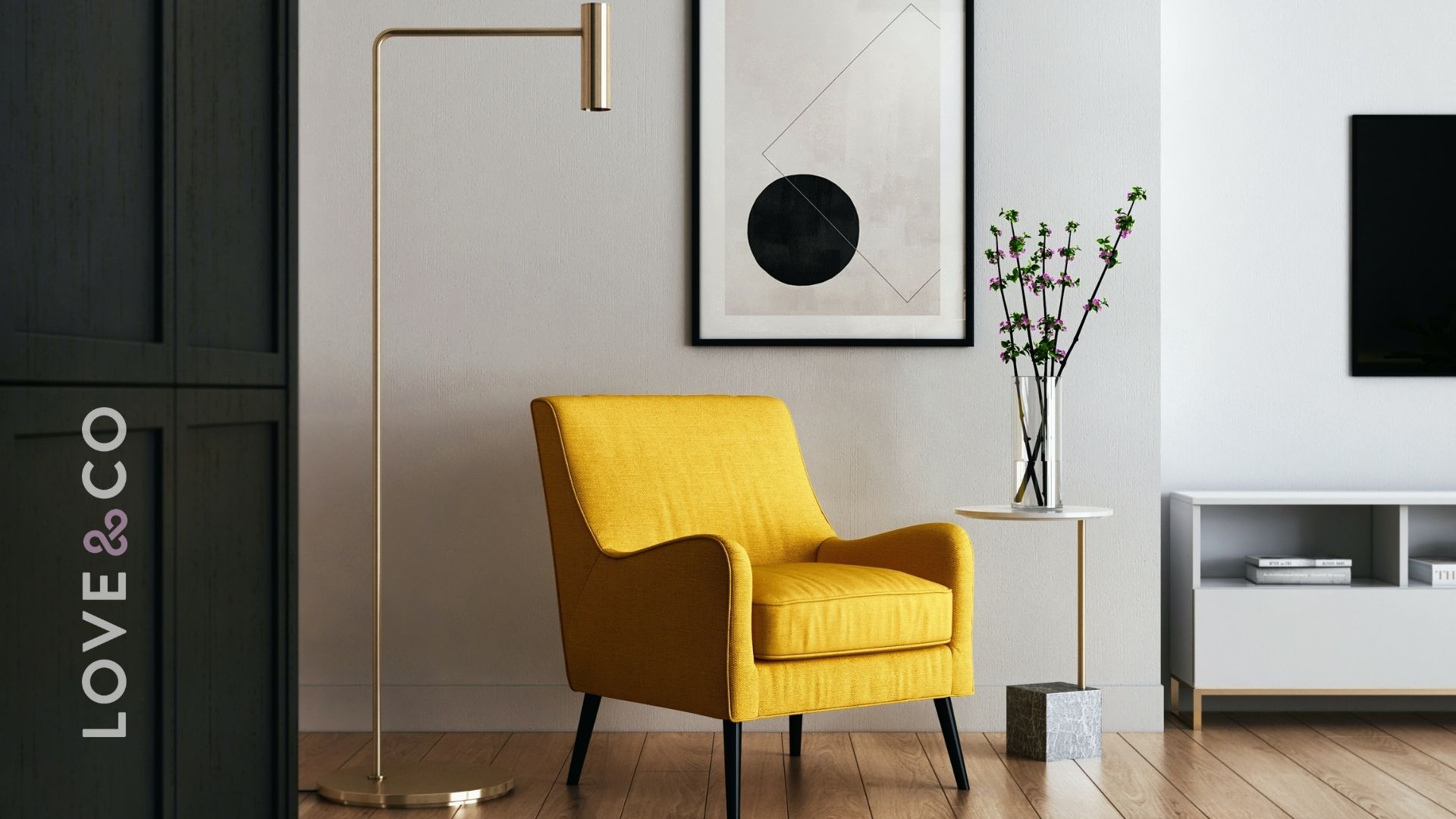
Yellow
The colour of sunshine! So it’s no wonder it is associated with joy, happiness, energy and intellect. In hallways, yellow can feel welcoming. However, studies show that people are more likely to lose their temper in an all-yellow interior, so it should be used sparingly! Dull or dingy yellow represents caution, decay, sickness, and jealousy and is rarely used in interior rooms. Bright yellow evokes optimistic feelings while light yellow is associated with freshness, intellect, and joy, and is a great outdoor house paint. Yellow is an uplifting colour, but you really have to pick the right shade. You want to make sure it’s not too muted or too bright.
Red
Red emotes feelings of strength, power, energy, war, danger, and determination, but also passion, love and desire. The various shades such as pink signifies romance, love, and friendship while reddish-brown is associated with harvest and fall, and dark red is associated with rage, anger, vigour, willpower, leadership, courage and malice.
Purple
Rich, dramatic and sophisticated, purple, in its darkest values can give a design scheme depth and is associated with luxury and creativity. Lighter values of purple, such as lilac, can add a restful feel to a bedroom. Interior designers use purple to add drama, add a bold statement with neon purple, create a chic feel by combining purple, pastels and modern art, or give a room a moody feel with dark purple as an accent.
Blue
Blue is associated with loyalty, trust, faith, wisdom, confidence, intelligence, truth, and heaven. Blue has a calming effect, it slows down the metabolism, so it is considered to be beneficial to the body and mind when used in the home or office. It is believed that blue can even help bring down blood pressure and slow the heart rate! Pastel or light blue can create tranquillity and is associated with healing, health, softness and understanding, but can come across as ‘chilly’ on the walls in a room that receives very little natural light. Dark blue represents integrity, knowledge, power and seriousness while deep midnight blue can create a feeling of luxury when used in a bedroom. Sapphire blues can be great as accent colours.
Green
The colour of nature. Considered the most calming colour for the eye, green can transcend a sense of security and calmness when used in interior design. Generally makes people feel emotionally safe, green symbolizes growth, harmony, fertility and freshness. Green is well suited for every room in the house and can have a calming effect when used as the main colour for decorating. But the various shades of green can evoke completely different feelings. Aqua is associated with emotional healing and protection while dark green is associated with greed, jealousy and ambition. Olive green is the traditional colour of peace yet yellow-green can indicate sickness, cowardice, discord, and jealously. You can decorate a whole room with greens and create a story of contrast, drama, richness, and balance. It’s so versatile!
It is pairing colours that can then get tricky though! In interior design, there some colour wheel basics you need to know.
Monochromatic Colours
For those that like to keep it simple, monochromatic colours may be the best choice for you. It is the use of only one colour, but in shades from light to dark, such as lilac to vibrant purple.
Triads
These form a triangle on the colour wheel, like green, orange and violet. These can also be used as accent colours, but they must be balanced or they can overwhelm a room.
Complementary Colours – Usually used as accent colours in small quantities, these are colours or hues that are directly opposite each other on the colour wheel, like orange and blue.
Analogous Colours
These are groups of colours that are right beside each other on the colour wheel, like orange and red.
Cool and Warm Colours
Cool colours are blues, greens, and purples, while warm colours are reds, pinks, oranges, yellows.
Non-Colours
Another for the minimalists at heart, non-colours are the beiges, browns, greys, whites and black. These still play a really important role in interior design as a chic and neutral feel to a space.
So what is the 2022 Colour of the Year?
Every year, Dulux colour experts translate global design trends into the new Colour of the Year and after much consideration, ‘Bright Skies’ has been selected as the Dulux’s Colour of the Year 2022 and what better choice could there have been than this hopeful shade for a fresh start in the new year? The cool-toned pale blue is capable of expanding even the smallest of spaces by mimicking the feeling of “open skies and a breath of fresh air”.
Initially the idea of a light blue room may seem cold or unfriendly but if styled in the right way, blue can be used to create truly incredible spaces. Blue Skies has the potential to bring an and openness and optimism to your home whilst creating the illusion of a much larger space.
Dulux’s most unexpected suggestion: to paint only the ceiling! Perfect for those who want to inject some colour into a space without overwhelming the walls. This trick raises the ceiling to lofty proportions. With its cool undertones, Bright Skies is said to provide the illusion of a far larger room because it makes any wall, surface or ceiling feel further away than it really is.
So, are you now feeling inspired to inject some colour into your home? We hope so! If you’re looking for some guidance, just reach out to any of our Love & Co property experts to chat about what trends they are seeing in demand currently in the market.
Credit:
https://theartcareerproject.com/psychology-of-color-interior-design/
https://www.luxdeco.com/blogs/styleguide/colour-psychology-interior-design
https://www.luxdeco.com/blogs/styleguide/dulux-colour-of-the-year-2022-bright-skies